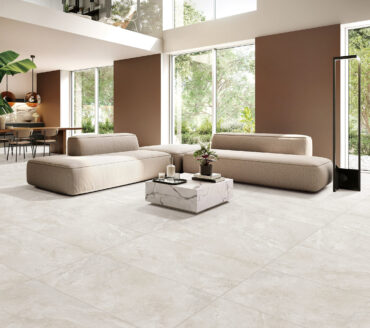
Feeling brave? Play with colour in a paired back way – you can still create compelling spaces without going big and bright. Clever, considered use of natural textures and tones can transform both look and feel.
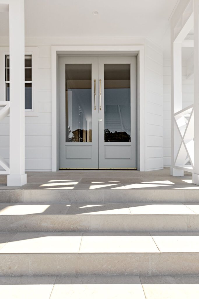
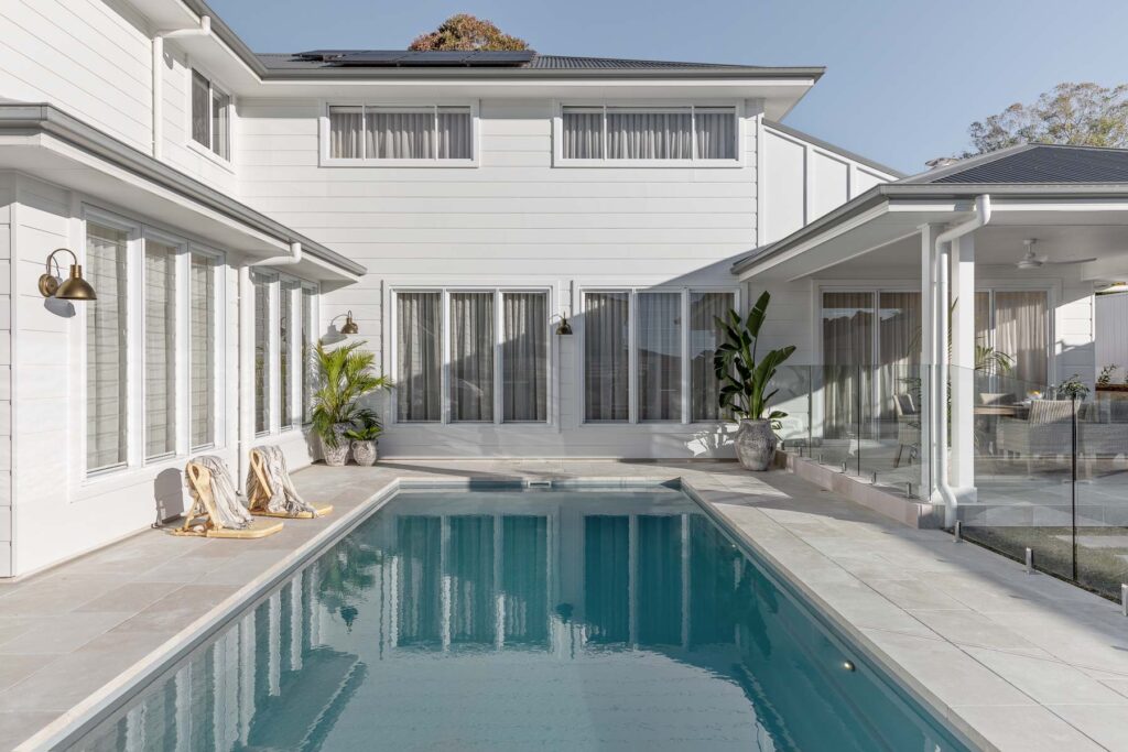
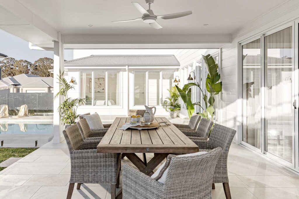
Colour, texture, natural materials and tile lay patterns are just a few of the design tools Oak&Orange have used to achieve their stunning Dream Home 7. Draw some inspo from this beautiful build, and step into the brave new frontier of home colour.
Colourful choices
Look to nature for the best tutorial on how-to-use bold colour. Green and beige are the ‘it’ tones currently having their moment in the sun (especially in joinery and tiles). And for a sure thing, you can’t go wrong by pairing these versatile hues with stone-look and timber-look tiles.
Look to our Look range for impactful, glossy wall tiles. They come in seven fab colourways and patterns with a finish reminiscent of traditional handmade tiles. Whether you’re sprucing up a residential or commercial space, these tiles are a great way to integrate colour.
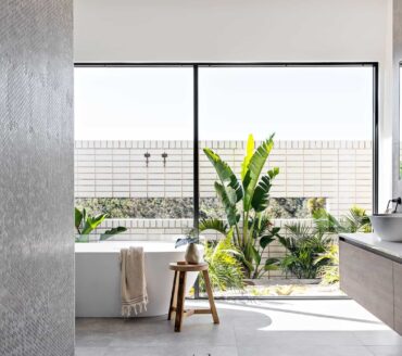
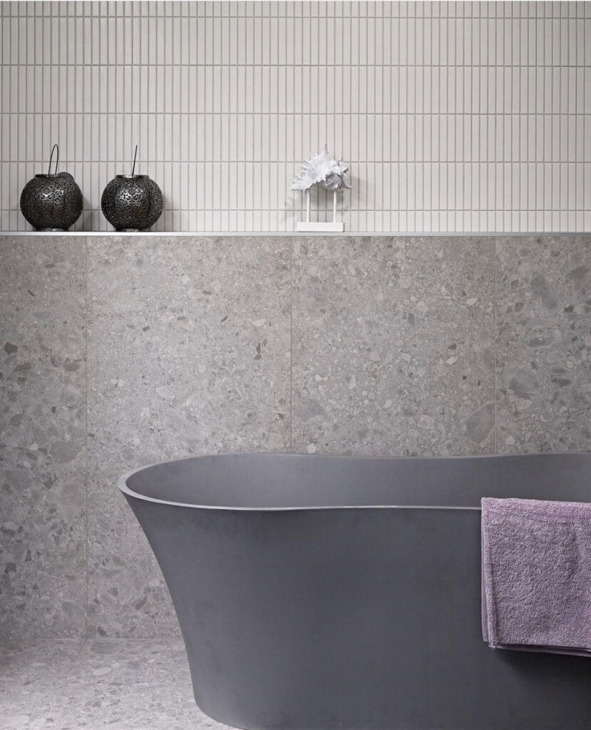
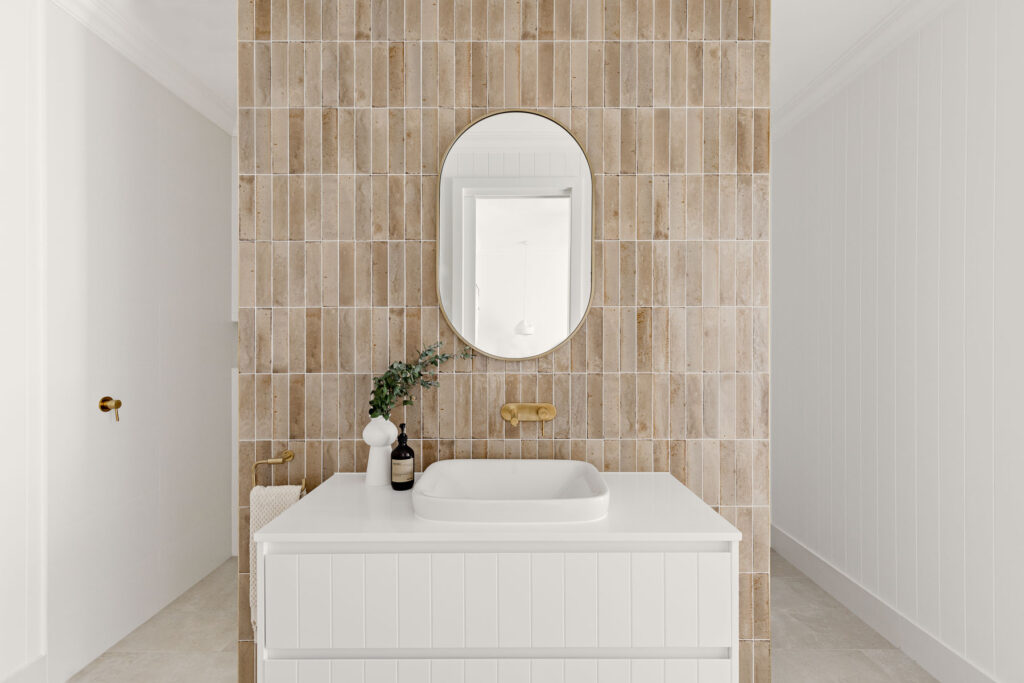
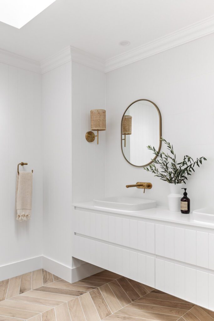
In your bathroom, work some luxe onto the walls with the beige colourway in a vertical stack pattern. These are a match made in harmony when used with the ever-versatile Cemento Pietra White on the floor.
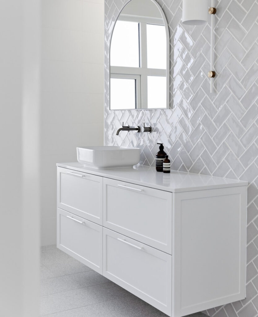
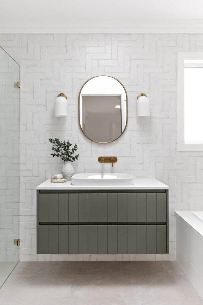
Keep patterns up your sleeve as a way to create a focal point for your space. A simple white tile in a basketweave lay acts as a canvas for a striking green vanity to pop.
Variations on a theme
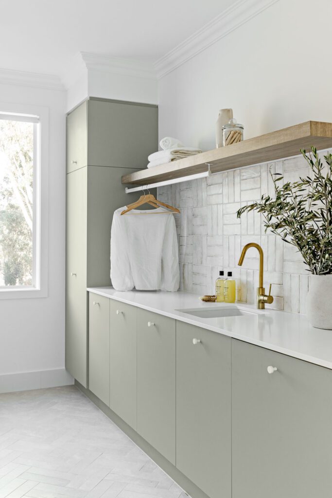
When your tendency is to play things a little safer in the main bathrooms, the laundry is the perfect place to stretch your colour muscles and bring some life to an otherwise dull doing space.
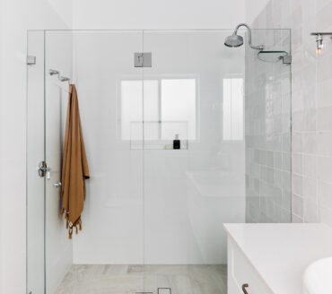
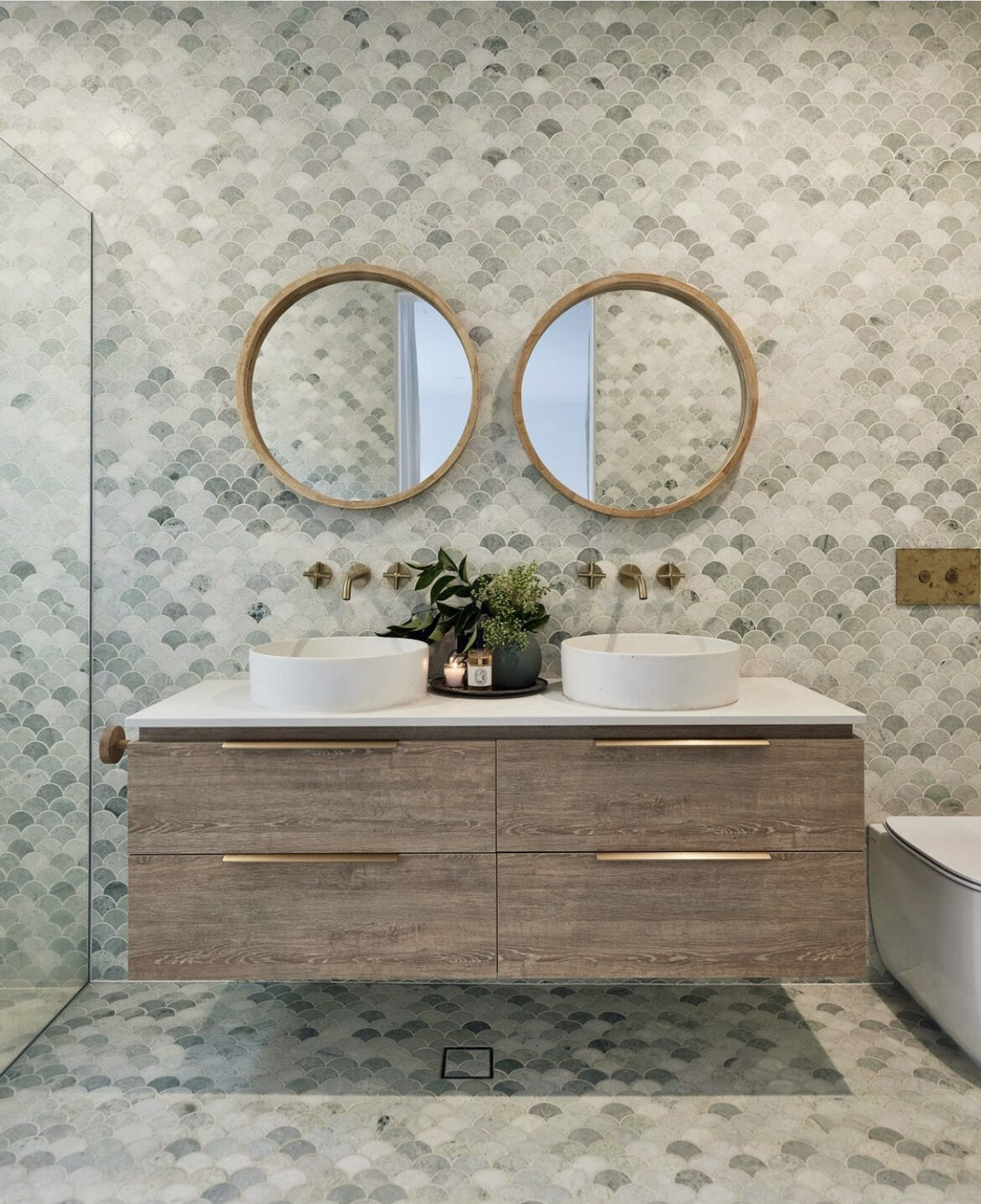
The Lusso in Natural has a unique honed finish; all the elegance and natural beauty of stone without the hard work. These tiles are at home internally or externally. Try them in a jaw-dropping double herringbone on the floor to subtly lift your space and bring a feeling of warmth and consideration. Couple this with the green joinery for a truly wow finish.
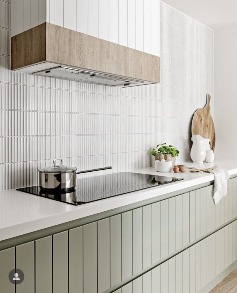
Another way to add visual interest is to align the texture in v-join walls and joinery with a neutral kit kat splashback and walled finger tiles. It’s all about balance. In five colourways, go for the classic Sticks range for a simple, enduring tile shape that will endure the trends.
Use subtle tiles with the intention to mimic vertical lines in the v-join and balance the colour in the joinery.
Textural complements
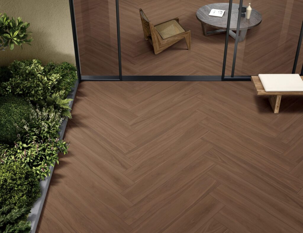
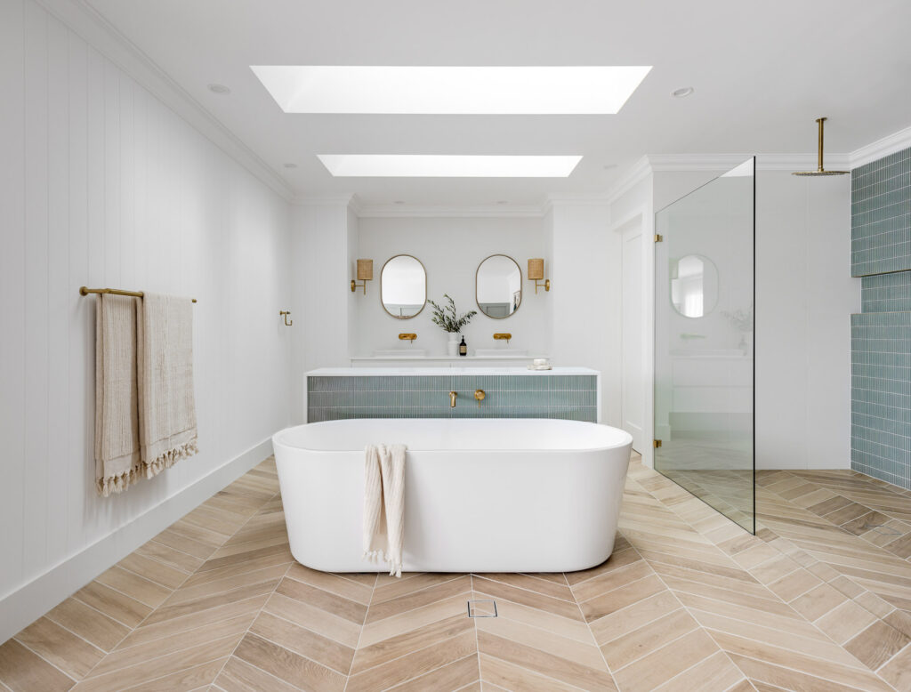
For flow, make sure your dominant feel runs throughout your home. Take the timber look into your bathrooms with our Treverksoul wood-look porcelain tiles. These tiles offer a fresh take on the elegance of parquet floors. Laying them in a chevron pattern is a practical and creative way to achieve modern sophistication and level up your space.
The natural tones in the timber-look tiles provide an opportunity to introduce other colours. The Sticks range in Sage looks incredible behind any bath and shower. Or you can keep it simple with white, and use texture to make up for the safe use of colour.
Colour your life
Up for a colour challenge in your next renovation or new build project? Think outside the white box – use colour with consideration and restraint to transform a great space into a gorgeous one. We’ve got tiles to act as a colour feature, and neutral tiles to bring texture.
Our design experts will guide you through the process and work with you to make smart selections that meet your brief. Come into your local ColorTile showroom, chat through your concepts, and bring your style to life.
Credits
Builder Oak&Orange
Photography supplied by Oak&Orange
Tiles by ColorTile